Best Restaurant Website Sections: Menu, Booking, Gallery, Reviews
The restaurant website sections that actually turn visitors into bookings — menu, booking, gallery and reviews — and how to lay each one out.
Most restaurant websites have the wrong things at the top and bury the things people actually came for. A visitor lands hungry, ready to book, and within five seconds decides whether to stay or open the next tab. Getting the restaurant website sections in the right order — and building each one properly — is the difference between a quiet inbox and a full diary.
This post walks through the four sections that do the heavy lifting: menu, booking, gallery and reviews. We will cover what each one needs, the mistakes that cost you covers, and how to lay them out so a phone-in-hand diner books in seconds.
Why the wrong sections cost you bookings
Picture the typical journey. Someone sees your venue on Instagram or in a Google search, taps through, and lands on your homepage on a phone with one thumb free.
If they can't find the menu, they leave. If the booking button is hidden in a footer, they leave. If the photos look like phone snaps from 2018, they assume the food matches and leave.
Every one of those exits is a booking that went to the restaurant down the road with a clearer site. You are not losing to better food — you are losing to a better-organised page.
The fix is not more sections. It is the right four, in the right order, each doing one job well.
The four restaurant website sections that win bookings
These are the sections that move someone from "looking" to "table booked". Get these right before you worry about anything else.
1. The menu — visible, current, and not a PDF
The menu is the single most-visited page on any restaurant site. People want to know what you serve and roughly what it costs before they commit.
- Use real text, not a flat PDF or an image of a printed menu. PDFs are slow on mobile, hard to read, and Google can't index them well.
- Show prices. Hiding them makes people assume the worst and bounce.
- Group clearly — starters, mains, sides, desserts, drinks — with short, appetising descriptions.
- Keep it current. A menu listing a dish you stopped serving in spring is worse than no menu.
- Add a one-tap link to book a table right beside the menu, while appetite is high.
2. The booking section — one tap, no friction
Once someone wants a table, your job is to remove every obstacle between them and a confirmed time.
- Put a "Book a table" button in the header so it follows them on every page.
- Use a booking widget that opens in place, not one that fires them off to a clunky third-party page.
- Offer a phone number and WhatsApp as a fallback for larger or last-minute groups.
- Confirm bookings instantly so people aren't left wondering.
If you want a fuller rundown of what separates a site that books from one that just sits there, our good restaurant website checklist goes deeper.
3. The gallery — proper photography, not phone snaps
Your gallery is where people decide whether the food is worth leaving the house for. This is the section that sells the experience.
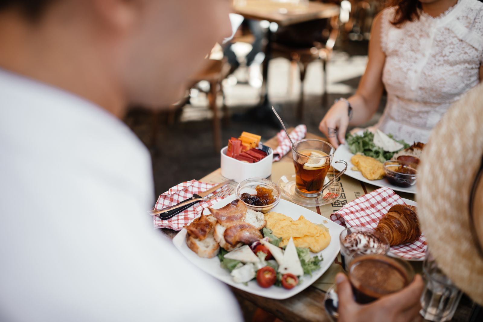
- Lead with bright, sharp food photography. Hero shots set the tone.
- Mix food, interior and a few lifestyle shots so people can picture the night out, not just the plate.
- Keep images optimised so they load fast — heavy photos slow the whole site and push diners away.
- Refresh the gallery as the menu and seasons change so it never looks stale.
Weak photography is the most common reason a good kitchen looks ordinary online. It is worth doing properly.
4. The reviews section — proof you are worth booking
People trust other diners more than they trust your own copy. A reviews section turns interest into confidence.
- Pull in your strongest Google and Tripadvisor ratings near the top of the page.
- Show a star rating and review count — the numbers do the convincing.
- Feature two or three short, specific quotes rather than a wall of text.
- Link out to the full reviews so it reads as genuine, not cherry-picked.
How Strapture approaches this
We build these sections to work together as one booking machine, not as boxes ticked on a checklist. Every restaurant website we design is mobile-first, with the menu and a booking button always within thumb's reach, fast-loading galleries, and real review proof on the page.
Take Artysansz Bistro & Bar in Hoddesdon. We moved them off Squarespace to a custom build with online reservations, an events calendar and monthly photography to keep the gallery fresh. The result: mobile PageSpeed went from 59 to 87, Largest Contentful Paint dropped from 13.4s to 4.1s, and page weight fell 54% — so the menu, booking and gallery all load before a diner loses patience.
That is the point of getting your restaurant website design right: every section pulls in the same direction, towards a booking. Photography, menu, copy and bookings are handled under one roof, so nothing is bolted on as an afterthought.
If you are weighing up what a build like this costs, our guide to restaurant website cost in London breaks down the numbers.
FAQs
What is the most important section on a restaurant website? The menu. It is the most-visited page and the first thing people check before booking. Make it real text, current, with prices shown — never a slow PDF. The booking button comes a very close second.
Should I show prices on my menu? Yes. Hiding prices makes diners assume the worst and leave to find a venue that is upfront. Clear pricing builds trust and filters for the right customers before they arrive.
How many photos should the gallery have? Quality over quantity. A tight set of 10 to 20 bright, well-shot images — food, interior and a little lifestyle — beats fifty average ones. Heavy galleries slow your site, which costs you bookings.
Do reviews really belong on my own website? Yes. Surfacing your best Google and Tripadvisor ratings on the page removes doubt at the exact moment someone is deciding. It is some of the most persuasive content you can show.
Can you redesign my existing site rather than start over? Often, yes. We start by looking at what you have and where bookings are leaking, then give you a fixed quote up front. Send us your current site and we will tell you what is worth keeping.
Get a proposal for your restaurant website
Send us your website link, your menu and your Instagram handle, and we will reply with a clear plan for the sections that are losing you bookings — and a fixed quote to fix them. See more of our work over on the case studies page.
Ready to start? Get a proposal or book a free 20-minute call. We reply within one working day.
And if you run a local business rather than a restaurant, the same section logic applies — we build websites for local businesses around the same structure.
Free · no obligation
Free restaurant website audit
Send us your current site and we'll reply with the three fixes that would recover the most bookings. Plain English, within one working day.
Goes straight to our inbox. We reply within one working day and never share your details.
Ready to talk?
Tell us about your venue and what you’re trying to grow. We reply within one working day.
Keep reading